
Power and print, or, Comments on the visual rhetoric of authority
“All thumbs and no fingers.” With this memorable turn of phrase, the American economist Charles E. Lindblom once famously attempted to describe some of the administrative inadequacies and institutional constraints so characteristic of early modern public administrations.
Indeed, as recent scholarship has not failed to emphasise, the early modern state – which was neither “early” nor “modern” and surely not a “state” in the modern sense – was not just caught up in a constant, albeit at times subtle, struggle for power and supremacy with competing organisms and rogue aristocrats, it also, and as a direct result of the former, had to rely heavily on a dense web of local proxies and scattered agents to assert, to defend, and to justify the narrow corridors of authority it had carved out for itself.
In a society where unenforceable laws revealed, day after day, the limits inherent to governance, and where modalities of disobedience at the disposal of the population were sprawling, encompassing a wealth of means ranging from basic unawareness to active opposition, the almost self-effacing insistence with which local and central administrations stated the authority which they themselves presumed to derive from the sovereign constituted an essential investment. One, however, which could potentially absorb horrendous resources. Still nowhere near the dystopian authoritarianism exalted in Maurice Blanchot’s Le Très-Haut (1948) where, as the novel’s unnamed protagonist apprehends in a grotesque reverence, the state is “in me, I feel its existence in everything I do through every fibre of my body”, local authorities in early modern Europe could not hope for such an exemplarily internalized obedience. Their authority was contingent upon an ongoing process of affirmation and proclamation. Hence the often so strange and to modern eyes estranging fixation on privileges and prerogatives. Likewise, the monarch – the embodiment of sovereignty legitimated by divine right – was not at all like Blanchot’s mysterious supreme figure, referred to in the novel as The Most High, who is everywhere and nowhere at the same time, incessantly invoked but never present. Much to the disappointment of monarchs and officials alike, however, power and authority needed to be seen to be true.
Acts of divine thanksgiving, such as the Te Deum, still observed in Luxembourg until this very day and as such an integral part of the national festivities marking the Grand-Duchy’s national day, functioned not only as essential expressions of loyalty to the sovereign, but also as rare opportunities for the broader masses to symbolically encounter a monarch they would most likely never meet in their lifetime. Decreeing public prayers to commemorate the ascension of a new sovereign, to invoke a swift recovery during sickness, or to pray for the soul of a deceased prince, as the Provincial Council of Luxembourg had done countless times throughout early modernity, these were all fitting contexts where the population would hear the name of their sovereign prince solemnly proclaimed. Lest we forget: as much as the portrait of a monarch minted onto a coin – a convention observed to this day as well – vouched for the nominal value struck on the reverse, we must not be oblivious of the fact that it also constituted one of the few official portraits that were by their very nature widely accessible and thus often acting as a reference. On equal footing with those portraits we find on early modern currencies, commemorative medals – albeit less accessible and often only distributed as a gift to officials – such as the one we can see just below of Maria Christina of Austria (1742-1798) and her husband Albert Casimir of Saxony (1738-1822) marking their return to Brussels after they had to flee the city in the wake of the Brabant Revolution, tied them to such nascent concepts as that of public welfare (Laetitia Publica), evoked on the obverse (fig. 1).

Within a social context where the state’s literal presence was more fragmented and contingent, its symbolical presence, mediated via emblems and by means of symbols, such as the aforementioned coins, and ceremoniously enacted during public rituals and festivities, was pivotal. In fact, public spaces where pervaded with visual markers giving expression to the society’s hierarchical organization, thus simultaneously expressing power relationships. As a fortress-city, this was particularly true of Luxembourg, where a relatively small urban space found itself under siege by the emblems of monarchical and imperial power, so to speak. To the astonishment of some, but hardly surprising to others, early modern denizens were well-equipped to navigate through this thicket of symbols, of coats of arms, and of royal insignia.

In contrast to the spoiled and unchecked gaze of the modern spectator, who, in the sight of crests and other such seemingly obscure armorial depictions, is put in a state of bewilderment and curiosity, to people living in early modern Europe, these signifiers of royal presence had a much less intimidating effect. They were perfectly valid and above all effective in commanding authority and inspiring obedience. Present in inscriptions that were to be found scattered across its ever-expanding fortifications, the Habsburg monarchy’s presence manifested perhaps most consequentially in its military presence. On skilfully decorated drums, regimental banners or, as we can see just above, engraved – by hand of course – on an officer’s spontoon (fig. 2), the visual representation of royal and imperial imagery was ubiquitous. Unsurprisingly, then, its resemblance with the visual language exhibited on early modern legal texts is both evident and self-explanatory.
Much like those visual markers that we have dealt with thus far, early modern legal texts, such as those presently on display in the National Library’s main reading room, were furnished with an entire apparatus of visual cues in support of their juridical legitimacy. This reiteration of an almost identical palette of emblems and other similar devices that people would encounter in the city is mirrored by and completed in the frame of a printed page. It is important to note that in the context of an early modern print, ornamental devices cannot be reduced to just one unilaterally defined function. On the contrary, notwithstanding their outspoken aesthetic appeal – they do just really look good, don’t they? –, they were also invested with a structuring role. In that capacity, they increased the intelligibility of a text by assisting the reader quite literally in navigating through the pages. Prominently positioned at the top of the document’s title or first page, these woodcuts commanded the attention of all who saw them. As evinced in the example just below (fig. 3), such an ornament could well occupy one third of an entire page.
Supported, just underneath, by an introductory formula set in a bigger font than the main text and which usually specified the nature of the document as well as the sovereign in whose name the law was decreed, this ensemble was evidently meant to have a visual impact – an-eye catcher of some sort, if one were to indulge in such lousy anachronism. But what was meant to rivet the eye of those passing through the urban space – where, as we will discuss in another blog post, these texts were read aloud and published – might seem unfamiliar, indeed, even alien to a contemporary audience.

That a legal text should begin with the representation of a mythical creature bearing a shield whose contents are almost entirely illegible to us, crowded with symbol upon symbol in the smallest of spaces, must strike contemporary audiences as more than merely alien, indeed, at times even unsettling. The creature in question here, of course, is none other than the double-headed eagle of the Holy Roman Empire and the Austrian Habsburgs, which ruled Luxembourg as its sovereign Dukes and Duchesses, and were the incumbent of that imperial dignity throughout the eighteenth century – leaving aside a most unfortunate intermittence between 1742 and 1745.
Topped by the imperial crown, each of the eagle’s head is surrounded by a halo, ultimate expression of the Holy Roman Empire being more than just a mere political entity. Above all, it was, in the eyes of many a contemporary, a community of fate, sacred and standing in a direct line of succession of the Roman Empire. Its wings and talons spread wide, the eagle’s chest is usually covered by the main shield, or escutcheon, in which the coat of arms of the ruling dynasty is prominently staged. Substantial alterations in or adjustments to the main shield occur – how could it be otherwise? – alongside changes in regime or dynasty. This happened, at least for the Duchy of Luxembourg, half a dozen times between the seventeenth and late eighteenth centuries.

Among the more subtle changes – that is, adjustments of content rather than of genre – that took place in the 1740s as, with the passing of Charles VI (1685-1740) and the (contested!) ascension of his daughter and heir Maria Theresa (1717-1780), the House of Habsburg became extinct in the male line and was replaced by that of Habsburg-Lorraine. This new dynasty sprung from the union between Maria Theresa and her husband, Francis Stephen of Lorraine (1708-1765). Taking a look at one of the imperial eagles employed on legal texts printed and published in Luxembourg during the rule of Charles VI (fig. XX), we notice that alongside the chain of the Order of the Golden Fleece, which still encircles Charles VI’s escutcheon but later on disappears –, it is above all the shield itself that undergoes modification. While Charles VI still bore the arms of his ancestor Charles V – ‘the emperor under whom the world broke apart’, as Heinz Schilling put it –, we observe under Maria Theresa the adoption of elements from the Lorraine heraldry, specifically drawn from the personal arms used by Francis Stephen as Grand Duke of Tuscany.
Produced locally, these heraldic depictions varied considerably both in terms of the quality of the material and of the finesse of execution. Often inferior copies of the qualitatively more refined woodcuts and engravings used in the capital, Brussels, the coats of arms and head vignettes employed in Luxembourg can be grouped into three major categories. The first of these we have seen and discussed already, namely the double-headed eagle. To this initial group must be added that of the coat of arms, frequently appearing as independent decorative elements (fig. 5 & 6). What is so interesting about these are the quick-paced intervals in which they change, particularly during the late seventeenth and early eighteenth century.
Over the course of just thirty years – between 1684, when Luxembourg fell to the French under Louis XIV, and 1714, when the Habsburg emperor Charles VI reabsorbed the duchy into the Habsburg Monarchy at the end of the War of the Spanish Succession (1700–1714) – the territory underwent no fewer than five regime changes. Each transition brought with it, at times, significant shifts in the social and political hierarchy. During each of these phases, however brief, new heraldic emblems appeared on the title pages of legal texts, each asserting the legitimacy of the new sovereign and the validity of the norms they promulgated.
-
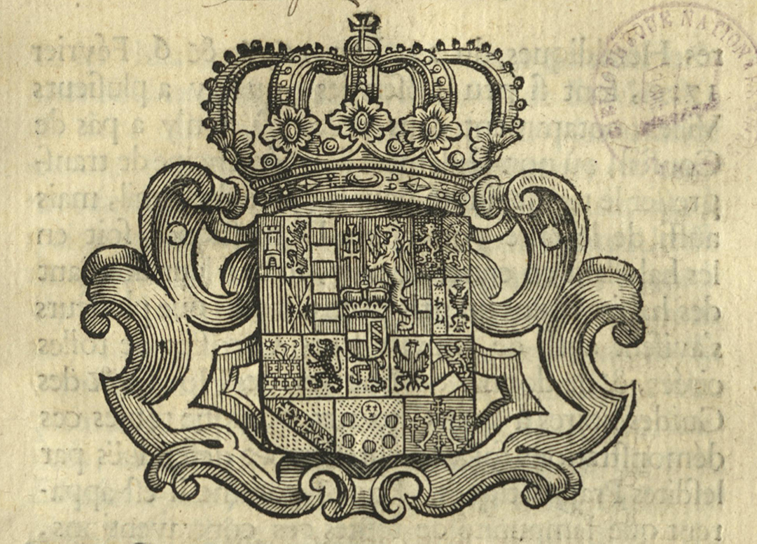
Figure 5
Bibliothèque nationale du Luxembourg, I.L. 7518, fol. 1r.
-
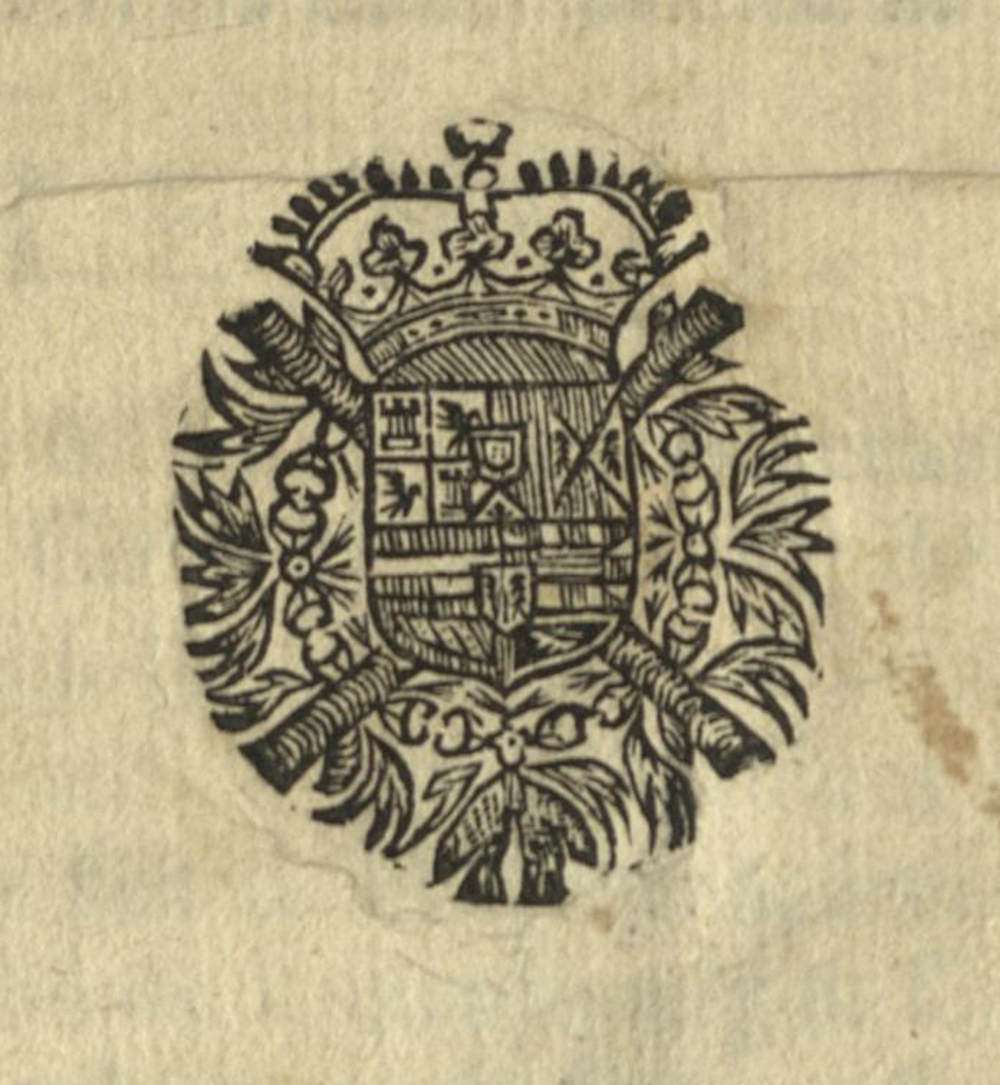
Figure 6
Bibliothèque nationale du Luxembourg, I.L. 5002, fol. 1r.
Finally, the third and last of the main categories comprise the so-called head vignettes (fig. 7 & 8), which came to be used more consistently during the co-regency and later the reign of Joseph II (1765-1780). Although, just like in the first examples, the double-headed eagle figures prominently in these ornamental devices, their entire composition is strikingly different. Alongside the layout, which now harmonises quite well with the body text, the entire visual rhetoric confined in the delineated rectangle is considerably expanded as there now is strong presence of a figurative visual language used.
-
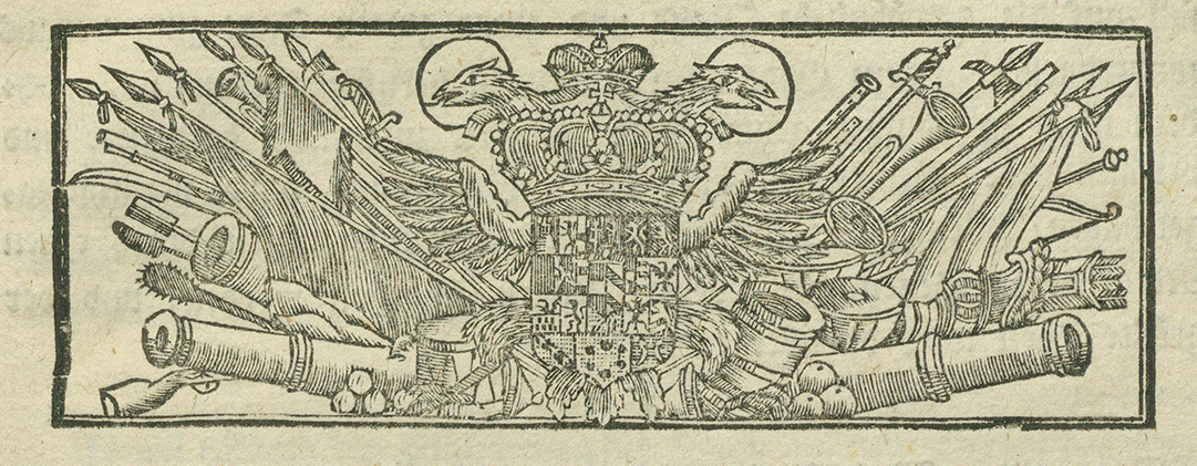
Figure 7
Bibliothèque nationale du Luxembourg, I.L. 7395, fol. 1r.
-
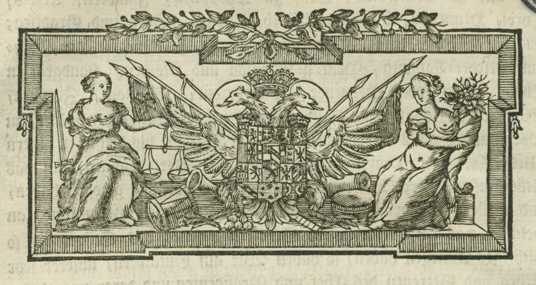
Figure 8
Bibliothèque nationale du Luxembourg, I.L. 5025, fol. 1r.
As figures 7 and 8 exemplify, especially since the second half of the eighteenth century legal texts are increasingly preceded by what can be interpreted as a visual preface to the actual document. With the death of Maria Theresa in 1780, enlightened despotism gets into full swing and the shift in Joseph II’s governing style doesn’t just echo in his legislature, but also reverberates – although to a lesser degree – in a changed iconographic programme which introduces these documents. Within the modest rectangular woodcuts, a distinct interpretive thread begins to assert itself, so to speak – one that delineated two increasingly competing visions of the state and its purpose.
Admittedly, in both examples the double-headed eagle firmly occupies the centre. The core, so at least it seems, is clear and secure. What changes, however, is the message that is conveyed, that sprawls to the edges. Both illustrations are more than partially shaped by a changing self-conception of monarchy, tied to an evolving image of rulership – and the ruler. The sovereign, once appointed by divine right and embodied most fully in the persona of the Sun King – where absolute sovereignty and the finite body of the king were literally confused, culminating in the programmatic declaration L’État, cest moi! – almost unnoticeably transformed, by the end of the 18th century, into the paterfamilias, who understood and styled himself as the first servant of the state.

That this new topos was most iconically practiced by Joseph II is well established. How it was translated into the visual language of normative texts already much less so. Among the more charming curios in the visual rhetoric of early modern normative texts is what may be the smallest known portrait of Emperor Joseph II (1741-1790) (fig. 9). A tiny woodcut embedded in an ornamental initial which represents the letter “J”.

This miniature likeness shows the emperor seated, dressed in a simple military uniform – in keeping with Enlightenment ideals – and flanked by nothing but the imperial crown. A typographic miniature that mediates the sovereign’s symbolic presence.
What makes this image even more fascinating is how closely it mirrors the full-length portrait of Leopold II (1747-1792), Joseph II’s brother and successor as emperor. Produced for his inauguration as Duke of Luxembourg and executed by Pierre Maisonnet (1750-1827) in 1791 (fig. 10), the composition is strikingly – yet not surprisingly – similar to the miniature of Joseph II. Leopold, too, sits, dressed in military uniform and surrounded by the emblems of the Holy Roman Empire; the same emblems which we have seen already in the ornamental devices above. The comparison is irresistible. Visually – and technically – worlds apart, they nevertheless speak the same language of power. These visual elements, whether they be woodcut initials, portraits, spontoons, coins, heraldic devices or typographical elements, draw from shared traditions. It is therefore hardly surprising that they reflect the same likeness and communicate power in such similar ways.
▪ A selection of similar documents will be on display in the display cases outside the Rare Books Reading Room on the first floor from July to August 2025.
Last update